


What if high contrast styling could feel balanced, not stark? The key is to choose where the light-dark split sits and how much of it you show. Start with a white shirt and black trousers, then soften the edge with a grey cardigan or tan shoes. For a quieter version, pair navy with cream or chocolate brown with ivory. These combinations still create contrast without the sharpness of pure black and white. If a dark jacket over a light dress feels too dramatic, add a mid-tone layer or use a light scarf to break up the dark area. Contrast is a styling choice, not a rule about who can wear which colors.
If you're unsure which pieces work together, or worry that a bold pairing will dominate your outfit, adjust the contrast in small steps. This guide explains how light and dark values shape a look, then walks through wearable combinations for different occasions. You’ll also learn how to fine-tune the effect with accessories, layers, and neutral pieces already in your wardrobe.
Key Takeaways
- High contrast styling is about the difference between light and dark values, not simply pairing different colors.
- Notice where light and dark pieces meet, since that point can draw attention and shape the outfit’s visual balance.
- Build a combination step by step: choose an anchor, add contrast, check the overall balance, then finish with shoes or accessories.
- Compare clothes you already own and use outfit feedback as a planning aid, not a rulebook for personal style.
Table of Contents
What High Contrast Styling Means in an Outfit
High-contrast styling uses a noticeable difference between light and dark parts of an outfit to create clear visual separation. A pale top with dark trousers can look more striking than two pieces with similar lightness, even if their colors are different. High contrast is a styling choice, not a rule tied to body shape, identity, or which colors someone is “supposed” to wear.
Lightness, hue, and saturation are different
Lightness describes how bright or dark a color appears. Think of an ivory shirt beside a black skirt: the light and dark values sit far apart. Hue is the color family, such as blue, green, or red. Saturation describes how vivid or muted a color looks.
These qualities can change independently. Muted navy and bright yellow differ in hue and saturation, but if they appear similarly dark, they may create less light-dark contrast than a cream garment beside navy. Teal and rust can also have similar lightness despite being distinct hues. To judge the difference, compare how light or dark the garments look rather than relying on their color names.
Why contrast changes an outfit’s overall impression
Light and dark areas create visual separation, which can make an outfit feel more defined. A dark olive jacket over a pale blue top, for example, creates a clear focal area around the upper body. The point where the colors meet may draw the eye, so placement matters: strong contrast near the face, at the waist, or between top and bottom can each create a different emphasis.
This is one reason visual contrast makes neighboring areas easier to distinguish. In clothing, the effect depends on the garments’ lightness, coverage, and placement. Make the contrast subtler by choosing a softer dark, such as charcoal, or a less bright light, such as stone. You don’t need to match an outfit to a prescribed personal contrast level. Choose the degree of separation that feels right and suits the impression you want to create.
How Light and Dark Pieces Create Balance
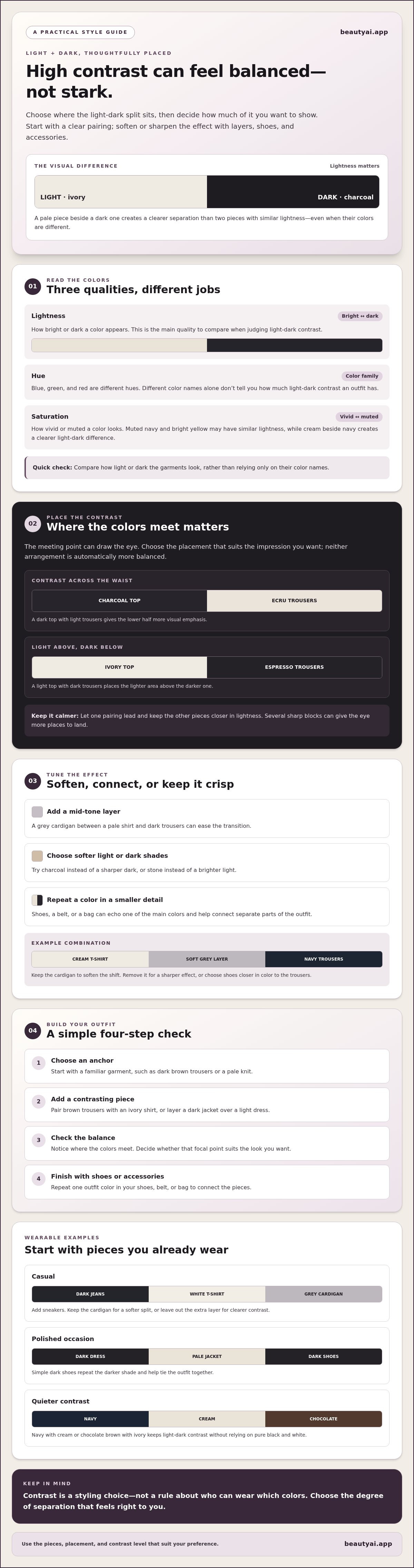
A light-dark pairing creates a visual meeting point, so consider where you want the strongest separation. A charcoal top with ecru trousers creates contrast across the waist, while an ivory top with espresso trousers places the light area above the dark one. Neither arrangement is automatically more balanced. The effect depends on the pieces you choose, how much of each color is visible, and where the contrast sits.
Choose where the strongest contrast sits
Pick one clear focal pairing first. A dark top with light trousers gives the lower half more visual emphasis; a light top with dark trousers draws attention higher. If you add several sharp blocks, such as a contrasting jacket, belt, and shoes, the eye has more places to land. For a calmer outfit, let one pairing lead and keep the remaining pieces closer in lightness. Contrast is a principle of design that can create a focal point, and you control how strongly it shows up.
Use neutrals to connect contrasting pieces
Bring in a neutral when the light-dark divide feels too abrupt. A grey cardigan between a pale shirt and dark trousers softens the transition. Cream shoes can echo a light top, while a navy bag or belt can repeat the darker piece and make the contrast feel intentional. Repeating one color in a smaller accessory can connect separate parts of an outfit without adding another competing block.
For example, pair a cream T-shirt with navy trousers, then add a soft grey layer and navy shoes. The shirt and trousers remain distinct, while the cardigan eases the shift between them. For a sharper effect, remove the cardigan. For a softer one, keep it or choose shoes closer in color to the trousers.
A Simple Process for Building High-Contrast Outfits
Build high-contrast styling around a piece you already wear. A dark trouser, pale knit, or favorite dress can anchor the outfit, so there’s no need to buy something new. Use this four-step check to make the contrast feel deliberate:
- Choose an anchor. Start with a familiar garment, such as dark brown trousers or a pale knit.
- Add a contrasting piece. Pair brown trousers with an ivory shirt, or layer a dark jacket over a light dress.
- Check the balance. Notice where the colors meet and decide whether that focal point suits the look you want.
- Finish with shoes or accessories. Repeat one outfit color in your shoes, belt, or bag to connect the pieces.
Start with one piece you already wear
For a casual outfit, try dark jeans with a white T-shirt and sneakers. Add a grey cardigan to soften the sharp split, or keep the layers minimal for clearer contrast. For a polished occasion, pair a dark dress with a pale jacket and simple dark shoes. Repeating the darker shade in your shoes helps tie the outfit together.
Adjust contrast for the occasion and your preference
Choose a bold version for a crisp light-dark effect, such as a white shirt with espresso trousers. For a softer alternative, switch to a cream shirt and add a mid-tone layer, such as a grey blazer. The trousers still ground the outfit, but the transition is gentler. Try both versions with clothes you own, then choose the one that feels right for your plans and personal style.
Use Outfit Feedback to Test High-Contrast Combinations
A digital wardrobe can help you compare complete outfits made from clothes you already own. For instance, review a pale shirt with dark trousers, then compare it with the same pieces plus a mid-tone layer. Looking at the combinations together can help you notice how the contrast changes the outfit, but a styling suggestion should remain an option, not a rule.
Compare the outfit, not your body
Focus on visible details: where the light and dark areas draw attention, how the pieces work together, and whether the combination suits the occasion. Beauty AI lets you plan outfits with clothes you own and offers AI-driven feedback on fit, color balance, and styling. Treat that feedback as one perspective, not a judgment about your body or attractiveness. If you want to organize your clothes first, see this guide to building a digital wardrobe.
Treat AI suggestions as options
Photos may not show garment colors exactly as they appear in person. Lighting, shadows, and camera processing can shift how a shade looks, so use visual feedback as a starting point and check the clothes in real light when possible. Photo-based color analysis can offer another point of reference, but it can’t establish a scientifically definitive color season.
Virtual try-on images are approximate visualizations, not proof of size or real-world fit. Neither image-based feedback nor a generated preview can assess fabric feel or guarantee comfort. Use the visual comparison to consider color and overall styling, then rely on the actual garments to judge fit and how they feel to wear.
Make Light-Dark Contrast Work for You
Use high contrast styling as a choice you can adjust, not a rule to follow. Start with a piece you already own, add one contrasting color, then decide whether the result feels balanced for your plans. A neutral layer or a repeated shade in your shoes or bag can soften the divide without losing definition.
Keep the focus on the outfit’s visible color balance and the impression you want to create. Comparing a few combinations can help you settle on a version that feels like you. Beauty AI lets you plan outfits with clothes you own and get AI feedback on fit, color balance, and styling. Treat its suggestions as options, not verdicts, and remember that visual feedback can’t confirm real-world fit, fabric feel, or comfort.
Try Beauty AI for outfit planning and explore combinations already in your wardrobe. Start with one simple pairing, then make it your own.
Frequently Asked Questions
What does high contrast mean in an outfit?
High contrast means there’s a noticeable difference between light and dark parts of an outfit. For example, an ivory top with black trousers creates stronger light-dark separation than a cream top with tan trousers. High contrast styling can make an outfit feel more defined and draw attention to where the contrasting pieces meet. The effect depends on the colors, their placement, and how much of each piece is visible.
Can anyone wear high-contrast outfits?
Yes. High-contrast outfits are a styling choice, not a rule based on body shape, identity, or natural coloring. Choose the level of contrast that feels comfortable to you. You might enjoy a sharp white-and-black pairing or prefer a gentler combination such as cream with navy. Neither option is more correct. The goal is to create an outfit that suits your taste and the occasion.
How do you make a high-contrast outfit look softer?
Introduce a middle tone or reduce the difference between the light and dark shades. For example, add a grey cardigan between a white shirt and black trousers, or swap bright white for soft cream. You can also keep one strong light-dark pairing and choose shoes or accessories in colors already present in the outfit. These adjustments preserve contrast while making the overall transition feel less stark.
Is black and white the only high-contrast color combination?
No. High contrast can come from any pairing with a noticeable difference in lightness, not just black and white. Try cream with navy, chocolate brown with icy blue, or a pale top with dark olive trousers. When comparing colors, consider how light or dark they look as well as their hue. Two different colors can have similar lightness and create a subtler effect.
Can an AI styling app tell whether an outfit has too much contrast?
An AI styling app can offer feedback on visible color balance and styling, but it can’t make a definitive judgment about your personal style. Beauty AI can help you plan outfits from clothes you own and consider how the pieces work together. Photos may show colors differently because of lighting or camera processing, and visual feedback can’t confirm real-world fit, fabric feel, or comfort.


