

The best clothing color combinations are not complicated: choose one anchor neutral, add one supporting color, and use a third color only as a small accent. Navy with white, black with camel, cream with olive, brown with blue, burgundy with gray, and tonal shades of one color work because the contrast is controlled and the palette looks intentional.
This guide is for anyone who owns enough clothes but still hesitates over which colors go together. It gives you a reusable color-matching system, 20 specific pairings, rules for contrast and undertone, and a fast way to test the result with your real wardrobe. Beauty AI is useful at the final step: compare outfit photos, improve balance, and save the combination that actually works on you.
The fastest clothing color combination framework
Build the outfit in visual order. The anchor covers the most space, the supporting color creates the relationship, and the accent adds energy without competing with everything else.
| Role | How much | Good choices | Example |
|---|---|---|---|
| Anchor color | About 60–70% | Navy, black, charcoal, cream, denim, camel, olive | Navy trousers and jacket |
| Supporting color | About 20–30% | White, blue, burgundy, rust, soft pink, sage | White shirt |
| Accent color | About 10% | Red, cobalt, yellow, metallic, bright green | Burgundy bag or red shoe |
The percentages are a decision aid, not a law. A dress may already occupy 80% of the look. In that case, shoes, a bag, jewelry, or a layer can provide the support and accent.
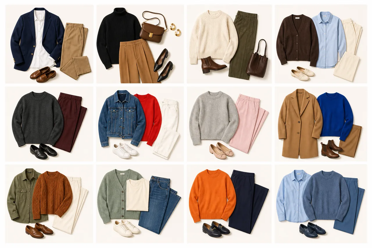
20 clothing color combinations that are easy to wear
These pairings work across casual, work, travel, and evening wardrobes. The examples are starting formulas, not shopping lists. Substitute similar pieces from your own closet.
| Color combination | Why it works | Easy outfit formula |
|---|---|---|
| Navy + white | Crisp contrast without the severity of black | Navy trouser + white shirt + tan shoe |
| Black + camel | Warm camel softens and elevates black | Black base + camel coat + gold accent |
| Cream + olive | Soft neutral meets muted earth tone | Cream knit + olive pant + brown loafer |
| Brown + light blue | Warm and cool tones balance each other | Brown trouser + blue shirt + cream bag |
| Charcoal + burgundy | Burgundy adds depth without looking loud | Gray suit or knit + burgundy top |
| Denim blue + red | A familiar base lets a strong accent feel wearable | Jeans + white tee + red cardigan or shoe |
| Black + white | Maximum clarity and easy proportion control | White top + black pant + one metallic accent |
| Gray + soft pink | Cool gray grounds a delicate color | Gray trouser + pink knit + white sneaker |
| Camel + cobalt blue | A quiet warm neutral frames a clear cool color | Camel skirt or coat + cobalt top |
| Olive + rust | Related earth tones create rich low contrast | Olive pant + rust knit + cream layer |
| Burgundy + blush | Two values from the red family feel connected | Burgundy skirt + blush blouse + brown shoe |
| Navy + green | Two deep cool colors feel polished together | Navy base + forest-green knit or bag |
| Chocolate + cream | High contrast with a warmer result than black and white | Cream trouser + chocolate top + tan accessory |
| Lavender + gray | Gray reduces the sweetness of pastel purple | Lavender shirt + gray denim or trouser |
| Sage + cream | Both colors are soft, calm, and easy to layer | Sage cardigan + cream tee and jeans |
| Orange + navy | Complementary energy with navy as the stabilizer | Navy dress or suit + small orange accent |
| Yellow + denim | Denim makes sunny yellow feel casual and familiar | Blue jeans + yellow knit + white shoe |
| Red + pink | An analogous pairing looks modern when saturation is controlled | Pink base + red bag, shoe, or knit |
| Tonal beige | Texture replaces strong color contrast | Stone trouser + cream knit + camel coat |
| Tonal blue | Different values create depth while staying cohesive | Light-blue shirt + mid-blue denim + navy layer |
What is the 3-color rule in clothing?
The 3-color rule says that an outfit usually looks easier to read when it contains no more than three noticeable color families. Neutrals can count, especially when black, white, or camel occupies a large area. Prints count by their dominant colors, not every tiny thread.
The rule helps when an outfit feels busy, but it is not a ban on color. You can wear more than three colors when one print unifies them, the saturation is similar, or several shades belong to the same tonal family. Use the rule as a diagnostic: if the outfit feels unresolved, remove one competing color before buying anything new.
How to choose colors by contrast
Contrast explains why the same two colors can look strong in one outfit and disconnected in another.
- High contrast: black + white, navy + cream, cobalt + camel. Clear, graphic, and more visible.
- Medium contrast: denim + burgundy, gray + pink, olive + cream. Versatile and usually easiest for daily wear.
- Low contrast: camel + cream, olive + rust, navy + forest green. Calm, elongated, and dependent on texture.
If a pairing feels flat, add texture or one lighter value. If it feels harsh, replace pure black or white with charcoal, navy, ivory, or camel.
Warm and cool undertones without the confusion
You do not need every item to share the same undertone. A warm-cool mix often creates the most interesting outfit. The useful question is whether the colors have a bridge.
- Use a neutral bridge: cream can connect olive and blue; denim can connect rust and white.
- Repeat one temperature near the face or in an accessory.
- Keep saturation similar: dusty sage sits more naturally with muted pink than neon magenta.
- When two colors fight, reduce the area of one color instead of rejecting the pairing.
Personal palette guidance can help with colors close to your face. The AI color analysis app workflow is useful for that question, while this guide focuses on how garments relate to each other.
How to combine colors from clothes you already own
- Choose the anchor. Start with the largest or least flexible item: trousers, a dress, a coat, or a suit.
- Add one reliable partner. Use the chart above or repeat a combination you already wear successfully.
- Photograph the outfit. A photo makes color area and contrast easier to judge than a mirror glance.
- Create version B. Change only the top, layer, or accessory. Do not rebuild the whole outfit.
- Save the winner. Record the exact formula so the discovery becomes reusable.
This method prevents a common mistake: treating color matching as permission to shop. The better first move is to make hidden combinations visible inside your current wardrobe.
Use Beauty AI as a color decision check
Beauty AI is most useful after you have two plausible versions. Upload the outfit photo and ask a narrow question: Does the accent repeat enough? Is the contrast too strong? Would a cream layer work better than white? Is the shoe introducing a fourth competing color?
Then connect color to the whole styling decision. A combination can be technically correct and still feel wrong because the proportions, occasion, or finish are off. Use the easy outfit formulas guide to build the structure, and the clothing color matching app guide when you want an app-first workflow.
Common clothing color matching mistakes
- Equal competition: three saturated colors occupy the same amount of visual space. Choose one leader.
- Accidental extra colors: the shoe, bag, belt, and coat each introduce a new family. Repeat or neutralize them.
- Ignoring texture: tonal outfits need knit, leather, denim, wool, or shine to create separation.
- Matching too literally: a red bag does not require exactly the same red shoe. Close repetition can look more natural.
- Testing colors without context: lighting, occasion, and the garment area change the result.
How to mix prints with color
Treat the print as a mini palette. Identify its dominant color, secondary color, and smallest accent. Repeat one of those colors elsewhere, then keep the remaining pieces quiet. A striped navy-and-white shirt already gives you two colors; denim plus a burgundy bag can complete the look without adding another competing print.
If the print is high contrast, use a lower-contrast base. If the print is soft and tonal, a stronger accessory can provide definition.
FAQ
What colors go well together in outfits?
Navy and white, black and camel, cream and olive, brown and light blue, burgundy and gray, denim and red, and tonal shades of one color are dependable starting points. Choose the pair according to the contrast you want.
Which color combination is best to wear?
There is no universal best pair. For the most flexible everyday option, use a neutral anchor plus one supporting color. Navy and white is crisp, cream and olive is softer, and black and camel feels more polished.
Do black and brown go together?
Yes. Use enough brown for it to look intentional, preferably through a substantial item such as a coat, trouser, knit, or bag. A cream or denim bridge can make the combination even easier.
Can an outfit have more than three colors?
Yes. More colors can work when a print connects them, several are shades of one family, or most appear only as small accents. The three-color rule is a simplifying tool, not a strict fashion law.
How can I tell whether outfit colors work together?
Take a full-length photo and check color area, repetition, contrast, and whether one color clearly leads. Compare one alternative version. Beauty AI can help explain why one version feels more balanced and save the winning combination for later.
Build a color system, not a bigger shopping list
Strong clothing color combinations come from hierarchy: one anchor, one partner, and an optional accent. Start with the 20 pairings above, adapt the contrast to your taste, photograph two versions, and save what works. Beauty AI can turn that one successful experiment into a repeatable wardrobe decision instead of another forgotten outfit idea.


